Those Weird Blotches Around Text: A Field Guide to Compression Artifacts
Compression artifacts are the visible byproducts of a lossy encoder trying to squeeze an image into a smaller file. They show up most often when an image is exported at mid-range quality (say, 60) and then recompressed again by the platform it's uploaded to - labels and fine detail can end up smeared or blocky. Each artifact type has a specific cause, and once you know what to look for you can usually identify which stage of the pipeline produced it.
Blocking: JPEG's Visible 8x8 Grid
Blocking, sometimes called macroblocking, is the most recognizable artifact in the JPEG format. You've likely seen it - that quilt-like grid pattern that turns smooth areas into a patchwork of tiny squares.
This happens because JPEG compression doesn't look at your image as one continuous picture. Instead, it chops the frame into 8x8 pixel blocks and applies a Discrete Cosine Transform (DCT) to each one independently. Think of the DCT as a process that translates spatial pixel data into frequency components, essentially describing each tiny square as a mathematical "recipe" of waves rather than individual dots.
The real trouble starts during quantization, which is the step where JPEG intentionally throws away data to shrink the file. Each 8x8 block has its high-frequency details stripped away on its own. At low quality settings, neighboring blocks lose different amounts of detail, and their boundaries stop matching up. The result is a visible grid.
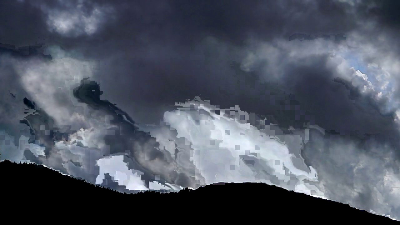
If you set the quality slider to 20 and compress a photo of a clear blue sky, you'll see it immediately. It becomes a checkerboard of slightly different blues where there should be a seamless gradient. Video codecs like H.264 use larger blocks up to 16x16, called macroblocks, which is why heavily compressed video sometimes looks like it's being viewed through a screen door made of bigger tiles.
Mosquito Noise: Ringing Around Sharp Edges
Mosquito noise refers to the shimmering, noisy halo that appears around sharp edges. You'll see this most often around dark text on light backgrounds, or any area where there's a hard transition between colors.
The technical cause traces back to the DCT again. Sharp edges in an image are packed with high-frequency information. When quantization strips that data away, the encoder can't accurately reconstruct the abrupt transition. Instead, you get a ringing effect, which is essentially a mathematical echo. This is the same phenomenon as the Gibbs effect in signal processing. Trying to rebuild a sharp step from limited frequency components creates "waves" or oscillations near the edge.
The name stuck because of how these artifacts dance and shift in compressed video, looking like a swarm of tiny insects hovering around an outline. In still images, they manifest as blotchy, "radioactive" halos that make every letter look slightly blurred. Screenshots are especially vulnerable because a webpage is full of the sharp edges JPEG wasn't built to handle. Unlike a photograph with natural gradients, a crisp letterform is exactly where these mathematical echoes are most likely to appear.
Color Bleeding: When Saturated Hues Cross the Line
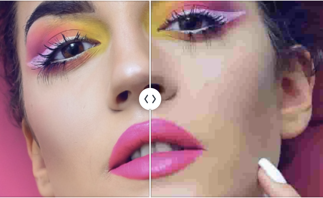
Color bleeding is the distinct artifact that makes colors appear to smear across boundaries, such as a red shirt bleeding into skin tones or green foliage smudging into a gray sidewalk.
This isn't actually caused by the DCT process. Instead, it's a result of chroma subsampling, a clever efficiency trick that happens before the frequency transform even begins. JPEG and most video codecs convert your image from RGB into a format called YCbCr, which uses one channel for brightness (luma) and two for color information (chroma). Since our eyes are far more sensitive to brightness than color, the encoder purposefully stores the color channels at a lower resolution than the brightness channel to save space.
The most common version of this scheme is 4:2:0, which stores color information at half the horizontal and vertical resolution of the luma channel. This means each color value is stretched to cover a 2x2 block of pixels. When a sharp color boundary falls in the middle of one of those blocks, the encoder is forced to pick one color to represent the whole area, causing the information to smear across the edges.
You'll notice this most often where saturated colors sit next to contrasting hues, like a red rose against green leaves or a yellow taxi against a blue sky. While the brightness edges stay sharp, the colors bleed out like a watercolor painting left in the rain.
The Red Channel Problem: Why Reds Suffer Most
If you have ever noticed that red elements in compressed images look especially blocky or muddy, you aren't imagining it. Reds actually get hit harder than other colors during the JPEG compression process. The primary culprit is again chroma subsampling.
In the technical world of JPEG (YCbCr), the 'Cr' channel is responsible for red-difference information. When the compression process slashes the resolution of this channel to save space, red details are often the first to lose their sharpness. Red also sits at a specific edge of the digital color spectrum where our eyes are much more likely to spot errors.
This is why photos of things like red dresses, brake lights, or vibrant flowers often look muddy compared to the rest of the image. While the brightness and overall structure stay intact, the actual color accuracy in those red regions takes a significant beating. It's a technical bias baked into the format.
Banding: Why Subtle Tones Struggle to Stay Seamless
Banding, also called posterization, happens when a smooth gradient turns into a series of visible steps. The cause is straightforward: quantization reduces the number of distinct values available to represent tonal gradations. A smooth gradient in the original image might use 200 slightly different shades of blue across its span, but after aggressive JPEG compression, those can collapse into just 15 or 20 distinct values. Your eye is remarkably good at detecting these gaps, especially in large, slowly changing areas like skies, backdrops, and out-of-focus backgrounds.

This effect gets worse every time you re-save an image, since each round of compression quantizes the already reduced tonal range again, collapsing more steps into fewer values. Three or four generations of JPEG re-saving can turn a clear sky into a series of harsh stripes. This is also why 8-bit images band more easily than images with higher bit depth. Fewer bits per channel means fewer possible values, which means the quantization cliff is closer to begin with.
Recompression Degrades Quality Generation by Generation
Every time you upload an image to a social media platform, there is a very good chance the site is recompressing it. This happens regardless of the quality settings you used originally. Platforms like Twitter, Facebook, and Instagram each apply their own unique compression pass. This means your image - which is already a lossy JPEG - is decoded and then re-encoded with a fresh round of quantization.
The problem is that the artifacts from your first save are now baked in as real image data. When the platform layers new artifacts on top, the quality begins to plummet. Each generation degrades further; if you upload a JPEG to one platform, download it, and move it to another, the accumulated damage quickly becomes obvious. By the third or fourth transfer, the image is often unrecognizable compared to the original.
This happens because recompression engines don't know where the original 8x8 block boundaries were located. If a platform resizes your image, the new blocks won't align with the old ones. This forces the encoder to process already-damaged data into a brand-new grid, creating a messy overlap. This lack of alignment is exactly why screenshots shared across multiple platforms eventually look heavily distorted and crunchy.
Minimizing Artifacts in Practice
You can't eliminate compression artifacts entirely with lossy formats, but you can make strategic choices based on what is actually in your image:
- Prioritize high-contrast content. Images with sharp edges, text, and strong color boundaries need more bits to encode accurately. A photo of a foggy landscape can often survive a quality setting of 70, but a screenshot of a code editor will fall apart. When in doubt, go higher.
- Use PNG for screenshots and text. PNG is a lossless format, meaning there is no DCT, no chroma subsampling, and no quantization involved. If your image contains text, UI elements, or line art, PNG will preserve every pixel perfectly. While the file size will be larger, the clarity is worth the trade-off.
- Avoid the JPEG-to-JPEG re-save. Every save cycle initiates a new round of lossy compression. If you need to edit an existing JPEG, save your working copy in a lossless format like PNG or TIFF. Perform all your edits there and only export back to JPEG as the very final step.
- Always keep your originals. Retain the highest-quality version of any image you care about. You should always compress copies for sharing while keeping your source files untouched.
- Optimize for social media targets. Some platforms are gentler with PNGs or images that already match their preferred dimensions. Uploading at the exact resolution the platform requests can often prevent a destructive resize-and-recompress cycle.
Most of the time the original photo isn't bad; the compression has been handled poorly. Knowing which artifact corresponds to which stage - the 8x8 blocking grid, mosquito halos around edges, colour smearing from subsampling, banding from quantisation, the red-channel loss - tells you which knob to turn to avoid it next time.