Responsive Images: Stop Serving Desktop Photos to Phone Screens
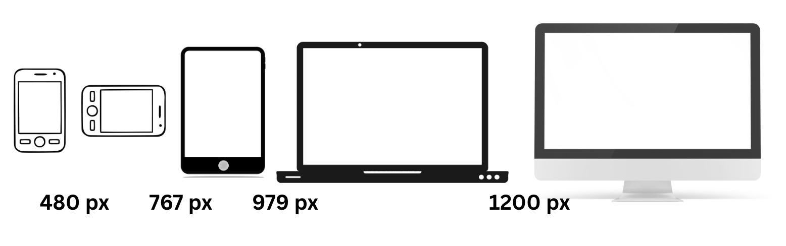
A photography portfolio can look great on a desktop, where the connection is fast and the screen is wide, and still take over ten seconds to load on a phone. The usual cause is a plain <img> tag serving one high-resolution file to every device, regardless of screen size. The browser ends up downloading several times more data than the device will ever render.
The Problem
A large image exported for a desktop monitor is usually around 2000px wide and 500KB. A mobile device with a 375px screen only requires an image roughly 750px wide, even when accounting for high-resolution retina displays. That smaller version ranges from 60 to 80KB. Using the desktop version forces mobile users to download eight times more data than necessary. These costs compound across a full page. A homepage with five large photos can reach 2.5MB when 400KB would suffice. On a standard 3G connection, this is the difference between a 3-second load and an 18-second load.
Web browsers can't see how an image will render until the CSS is parsed and the layout is calculated. By then, the preload scanner has already fired off a request for whatever URL it found in the src attribute. HTML must provide the browser with enough information upfront to make a smart choice. This is the role of srcset and sizes.
The srcset Attribute: Giving the Browser Options
The srcset attribute gives the browser a menu of image files at different widths. The browser then picks the most appropriate one for the screen.
<img
src="hero-800.jpg"
srcset="
hero-400.jpg 400w,
hero-800.jpg 800w,
hero-1200.jpg 1200w,
hero-1600.jpg 1600w,
hero-2000.jpg 2000w
"
sizes="100vw"
alt="Mountain landscape at sunset"
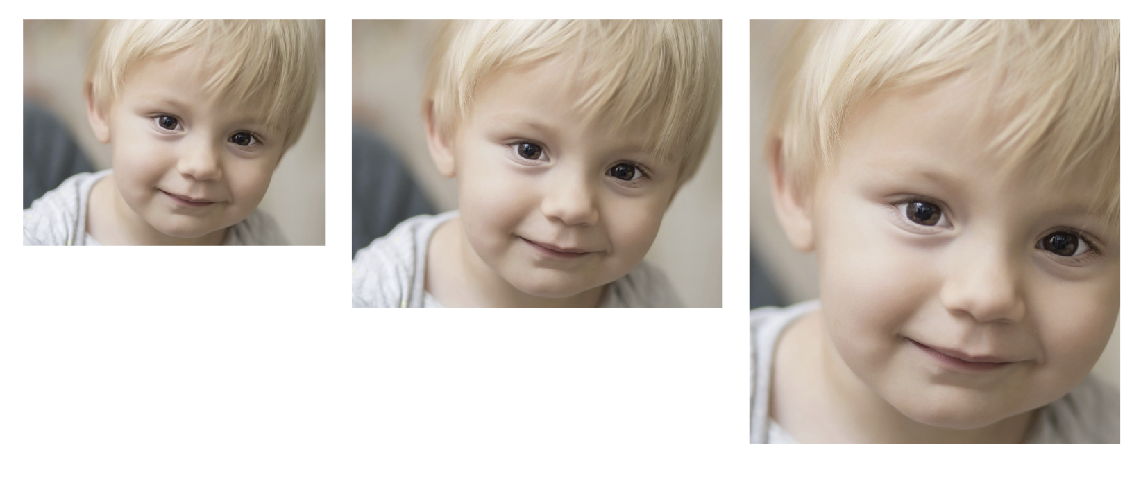
>The w descriptor tells the browser the actual pixel width of each file. The src attribute is the fallback for older browsers that don't support srcset—basically just IE11, which we can finally let go. But srcset alone isn’t enough. The browser knows the viewport width and the device pixel ratio, but it doesn't know how wide the image will actually render on the page. That's what sizes is for.
The sizes Attribute: Telling the Browser How Big the Image Will Be
The sizes attribute pairs media conditions with the display width of the image. This acts as a guide for the browser to understand the image layout before the CSS is parsed.
<img
  src="hero-800.jpg"
  srcset="
    hero-400.jpg   400w,
    hero-800.jpg   800w,
    hero-1200.jpg 1200w,
    hero-1600.jpg 1600w,
    hero-2000.jpg 2000w
  "
  sizes="
    (max-width: 600px) 100vw,
    (max-width: 1200px) 50vw,
    33vw
  "
  alt="Mountain landscape at sunset"
>
Based on these rules, the image takes up the full screen on devices up to 600px wide. Between 600px and 1200px, it takes up half. Above that, it only takes up a third. The browser uses this info along with the device pixel ratio to grab the smallest file that still looks sharp.
Getting sizes wrong is a common way to accidentally bloat a site. If the attribute says 100vw but the image is actually tucked into a sidebar at 33vw, the browser downloads a file three times larger than it needs to. It's a simple mistake that can undo all your hard work with srcset.
Generating Multiple Sizes
Creating all these image variants is the tedious part. There are three realistic ways to handle it:
-
Build tools: If you're using a bundler, something like
responsive-loaderfor Webpack orvite-plugin-image-presetscan generate multiple sizes at build time. You define your breakpoints, and it spits out the files and the markup. This works well for static sites. -
CDN auto-resize: Services like Cloudinary, Imgix, or Cloudflare Image Resizing generate sizes on the fly via URL parameters. Requesting
hero.jpg?w=800gets you an 800px version. There is no build step or need to store dozens of variants. This approach handles caching and format negotiation automatically. - Manual: Using Photoshop or ImageMagick is fine for a few images on a personal blog, but it doesn't scale to a CMS with hundreds of uploads. If you only have five hero images and they don't change often, a quick batch script works.
How Many Breakpoints Is Enough?
Developers often lean toward two extremes: generating fifteen variants every 100 pixels or serving only two versions labeled "small" and "large." Neither approach is ideal for real-world performance.
A practical target is four to six sizes for a given image. Using widths like 400, 800, 1200, 1600, and 2000 covers phones, tablets, laptops, and large desktops with enough detail. Going smaller than that offers diminishing returns. The tiny file size difference between a 900px and a 1000px image rarely justifies the extra storage and cache bloat.
Common Mistakes Worth Avoiding
-
Wrong sizes attribute. This bears repeating because it's the number one mistake. If your CSS says the image is 50% of the viewport but your
sizessays 100vw, you've doubled the download. Audit yoursizesvalues against your actual CSS layout. - Forgetting DPR. Serving a 375px image to a 375px, 2x screen looks blurry. Always account for at least 2x. Most of your mobile users are on retina or equivalent displays.
-
No fallback src. Always include a plain
srcon the<img>element. It's your safety net. Pointing it to a mid-range size - 800px - works for most cases. -
Ignoring lazy loading. Responsive images and lazy loading are complementary, not competing strategies. Add
loading="lazy"to below-the-fold images andfetchpriority="high"to your hero image. They work alongsidesrcsetperfectly. -
Over-engineering it. If you're serving a 200px thumbnail in a card grid, you probably don't need five variants. Two or three will do. Save the full
srcsettreatment for large, impactful images where the byte savings justify the complexity.
Example: 4.2MB to 680KB on Mobile
In the photography portfolio scenario from the opening, implementing srcset with proper sizes and WebP sources changed everything. By generating five width variants per image, the homepage size dropped from 4.2MB to 680KB on mobile. Load times fell from 11 seconds to under 3. These are the same images with the same visual quality, just delivered intelligently.
The srcset and sizes syntax is awkward, and getting sizes right requires thinking about the layout at each breakpoint. The payoff is that the browser can choose the smallest file that still looks sharp, rather than always downloading the biggest one.